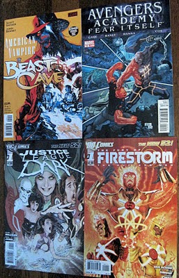
Comics Briefly: American Vampire #19, Avengers Academy #19, Justice League Dark #1, The Fury of Firestorm #1
Favorite Book This Week: Huh. All the books had highs and lows this week.
Favorite Writing: American Vampire.
Favorite Art: Justice League Dark.
All Issues new in stores on 9/28/11
American Vampire #19
Writer: Scott Snyder, Artist: Jordi Bernet, Colors: Dave McCaig
Darn, this issue was not as good as I was hoping it would be. It has some very strong bits of dialogue, although I think adding extended early history between Skinner and Book at the very start of the issue is unecessary and just clogs up the story. Once the plot gets going it gets pretty good, but I really dislike Bernet's art. The cover is pretty, but totally misleading for what's inside. The final splash page, in particular, is awful. I mean, maybe they're trying to evoke a sort of oldfashioned cartooning style, but it doesn't match anything, even in this issue, and I just think it takes a moment that should be scary and awesome and makes it WTF?
Avengers Academy #19Writer: Christos Gage, Penciler: Tom Raney, Inker: Scot Hanna, Colorist: Jeromy Cox
Fairly good, if wussy, ending to their Fear Itself tie-ins, although there was something a bit off. Maybe it was rushed? There's just something a bit odd in pace and tone. Good character beats here and there. Finesse's mask looks different all of a sudden and I hate it. Veil at the end brings some great perspective to the plot, although it does make me wonder where they can go from here.
Justice League Dark #1Writer: Peter Milligan, Art: Mikel Janin, Colors: Ulises Arreola
Huh. This was a pretty good reintroduction/introduction to the magic characters of the DCU, although I'm not completely sold on the idea. With the possible exceptions of Zatanna and Constantine, they seem a little angsty for a super-team. What do they think this is, the X-Men? Nice scene-let between Bats and Z, but the other Leaguers are in too many panels, because apparently we need to remind everyone that even though he now has "armor", Superman is a wuss in the face of magic. I'm more interested in the premise than in any plotlines started in this issue, but it's competently done, and fairly pretty. I read it twice today and little of it is sticking with me, though.
The Fury of Firestorm #1
Co-Plotters: Gail Simone and Ethan Van Sciver, Writer: Gail Simone, Artist: Yildray Cinar, Colorist: Steve Buccellato
I don't know. Maybe I'm just tired of #1 issues at this point, but I saw a whole lot of sound and fury here, but didn't really care. The tone turned me right off from page one. I'm tired of the volume of "edgy" I've seen in the last month. There's a lot of unanswered questions, way too many for a first issue for my money. Not the kind that make me think: "Oh I want to find out the answer, I better get Issue #2", the kind that make me think: "Well, that made very little sense. Maybe I'll check back in once the first arc is done and see if it ever came together." And I really don't have any desire to re-read this issue to see if I'm missing anything. Maybe Erin will come home and read it and love it.
Flipped through a few others in the store:
Aquaman and Teen Titans: neither looked bad but nothing I'm going to go out of my way for.
All-Star Western seemed okay but nothing that grabbed me
Green Lantern: New Guardians almost managed to disguise the fact that they did exactly nothing in 20 pages... almost.


Comments
Post a Comment
FYI: Most comments are moderated, and will not appear immediately.